Soundela Website V1 - Small Sounds. One System
Share this article
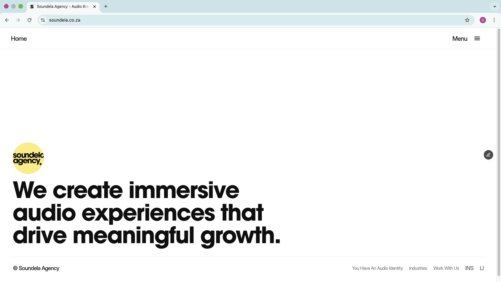
Small sounds. One system.
This isn’t a case study.
It’s a look at a few sound ideas we tried while building the Soundela website — and what we learned along the way.
Most of these sounds are easy to miss.
That’s kind of the point.
They’re not meant to perform. They’re meant to behave.
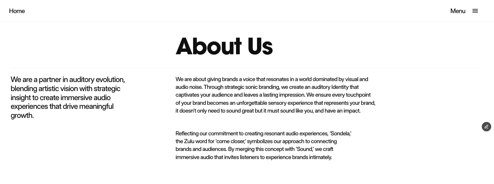
About page: sound as identity (without explaining it)
On the About page, the goal wasn’t to explain who Soundela is. It was to hint at it.
We kept asking ourselves how sound could hint at identity instead.
There’s a section that talks about where the name comes from — Soundela, derived from Sondela, meaning to come closer.
So we explored what would happen if that moment responded to attention. Instead of illustrating that visually, sound does the work.
When someone hovers over this section, a Zulu royalty chant plays.
It’s unexpected.
It doesn’t announce itself.
It just happens.
A small moment of surprise — full, confident, and rooted.
Just a brief, full sound that appears and disappears. If you never hover, you never hear it.
That’s fine.
Capabilities
The capabilities section is just a list — until it isn’t.
That’s when the idea of treating each capability as a note on a piano surfaced.
We explored what would happen if:
hovering one service played a single note
moving to the next played another
Suddenly, the list wasn’t just read — it was touched. Followed by designing the tonal of the piano and which notes would work well together in any arrangement and feel right.
Scroll quickly and it feels responsive.
Slow down and you realise you’re playing something.
There’s no instruction.
No prompt.
Just a list that quietly invites interaction.
If someone discovers it, great.
If they don’t, the page still works.
Articles page: borrowing from interfaces
Music didn’t feel right here.
It added too much meaning.
So we explored using click sounds as you scroll through articles.
Not musical.
Not expressive.
More like:
moving between options
navigating choice
reinforcing motion
Sound as feedback rather than decoration.
When everything started to feel disconnected
All of these ideas were built separately.
Different pages.
Different intentions.
Different sound types.
But they couldn’t sound separate.
So everything was routed through the same processing chain.
Same tonal treatment.
Same spatial feel.
Same loudness logic.
The goal wasn’t consistency for branding —
it was to make the site feel like one instrument, not a collection of sound effects.
Many behaviours.
One voice.
One final rule
After all of this, one more thing became obvious:
No sound should force itself on anyone. So everything on the site listens to a global audio switch.
On means sound becomes part of the experience.
Off means the site stays purely visual.
One decision.
One state.
Everything respects it.